Smothis: A Display Font That Commands Attention
It was 3:47 p.m. on launch day—two hours before the Instagram Stories countdown went live for our client’s new online course series. I’d just opened the thumbnail mockup for their YouTube trailer and realized the headline felt… soft. Not wrong, exactly—but forgettable in a feed where viewers scroll past in under half a second. That’s when I swapped in Smothis. Instantly, the energy shifted. The title didn’t just sit there—it leaned forward.
What Smothis Actually Feels Like in Practice
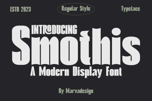
Smothis is a display font with confident, slightly sculpted letterforms—rounded but not playful, bold but not aggressive. It has subtle contrast, gentle curves, and an organic rhythm that reads as both modern and human. Think of it less as “decorative” and more as intentionally expressive: it carries tone without needing extra graphics or effects. In campaign work, that means fewer layers to manage and stronger message delivery from the first glance.
It’s not trying to be neutral. It’s designed to anchor a visual hierarchy—not blend in. That makes it ideal for moments where you need immediate recognition: a limited-time offer badge, a course name on a Pinterest pin, a Reels cover text overlay, or a banner above a product carousel. You’re not choosing Smothis to disappear into the background—you’re choosing it to hold space.
Where It Shines (and Where It Doesn’t)
In real use across platforms, Smothis consistently performs best at sizes 28px and up—especially on mobile previews and thumbnails. On Instagram posts, it holds clarity even when placed over busy lifestyle imagery (just add a subtle drop shadow or light stroke for contrast). On YouTube thumbnails, its open letter spacing and balanced weight prevent visual crowding at small resolutions. And for email banners or digital ads? It creates instant tonal alignment—no need for extra icons or color blocks to signal “this is important.”
But let’s be practical: Smothis isn’t built for body copy, pricing tables, or multi-line feature lists. Its personality is too strong for dense information—and its character set doesn’t include extended numerals optimized for data-heavy contexts. It also doesn’t scale gracefully below 20px on dark backgrounds without careful contrast testing. If your campaign relies on tight, scannable microcopy (like a checkout page or FAQ section), pair Smothis with a clean sans serif instead of forcing it to do double duty.
Pairing Smothis With Purpose
I default to pairing Smothis with a warm, highly legible sans serif—something like Inter, Poppins, or Montserrat—for supporting text. Their neutrality lets Smothis breathe while keeping everything feeling cohesive and intentional. For editorial-style quote graphics or branded template packs, I’ve tested it alongside a quiet serif (e.g., Lora or Playfair Display) for contrast that feels curated, not chaotic. Avoid stacking it with another high-personality font—like a dramatic script or exaggerated handwritten style—unless you’re deliberately going for maximalist branding (and even then, limit it to one accent word).
One note on file support: Smothis includes OpenType features like stylistic alternates and ligatures—small details, but they matter when building reusable templates. I used the alternate “g” and connected “fi” ligature in a webinar banner series, and the subtle polish made the whole set feel more considered. Just remember to check licensing before dropping it into client assets, merch, or downloadable design kits—commercial use rights are included, but always verify multilingual support if your audience spans multiple languages.
Real Campaign Moments, Real Decisions
Last month, we rolled out a seasonal shop campaign across Instagram, Pinterest, and email. We used Smothis for all primary headlines: “Summer Edit Live,” “New Arrivals Drop,” and “Your Cart Just Got Sweeter.” Each variation kept the same voice—friendly but polished, energetic but grounded. On Pinterest, pins with Smothis headers saw noticeably longer dwell time in preview mode (based on internal swipe-back metrics), likely because the type stood out cleanly against lifestyle photos without competing with them.
For a YouTube thumbnail set promoting a three-part workshop series, we kept Smothis consistent across all three thumbnails—same weight, same tracking, same vertical alignment. That repetition created visual continuity viewers recognized before even reading the subtitles. And in email banners? It helped segment messaging instantly: “Smothis + bold color = announcement,” while “Smothis + muted palette = reminder.” That kind of consistency builds subconscious brand association faster than any logo lockup.
That said, I skipped Smothis for the actual course syllabus PDF and the mobile-optimized landing page subheaders—too much visual weight for sustained reading. Instead, we used it strictly for the hero banner, CTA button label (“Start Learning”), and social share cards. Discipline matters: Smothis works because it’s used selectively, not exhaustively.
Final Notes Before You Install
If you’re evaluating Smothis for your next campaign, ask yourself: Is this moment about impact—or explanation? Does the message benefit from warmth and presence, rather than neutrality or formality? Will it appear where people decide in under two seconds?
It’s not a universal solution—but few premium display fonts are. What makes Smothis valuable is how reliably it delivers on its promise: to elevate a headline, unify a visual series, and quietly reinforce tone without shouting. It’s the kind of font that earns repeat use—not because it’s trendy, but because it solves real problems in real workflows.
And yes—it still looks great at 3:47 p.m. on launch day.